
ExploraTour: A Peek into the Lives of the Stars
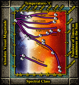
Let's look at a real HR Diagram...
A great number of stars were arranged on this chart according to how bright and how hot they are. On this plot you do not see all of the individual stars. Large numbers of stars were actually scattered around and along each of the lines that you see. These are not shown but a few stars were selected to be plotted on the graph as large white spheres.
The stars that appear near the top of the chart are the brightest and those toward the bottom are the faintest. This is not how the stars appear to you gazing into the night sky. These brightnesses are how the stars would appear if they were all moved to the same distance away from the earth (~10 parsecs away).
The hottest (bluest) stars are plotted at the far left and the coolest (reddest) stars appear at the far right.
The lines represent different types of stars: hypergiants, supergiants, giants, subgiants, main sequence stars and white dwarfs. Click on the links below to find out where these types of stars appear on the HR diagram?