Where are we now? Climate "Today"
Before we move on to projections of future state of our planet's climate, let's take a few looks at the current state of Earth's climate.
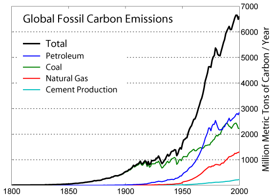
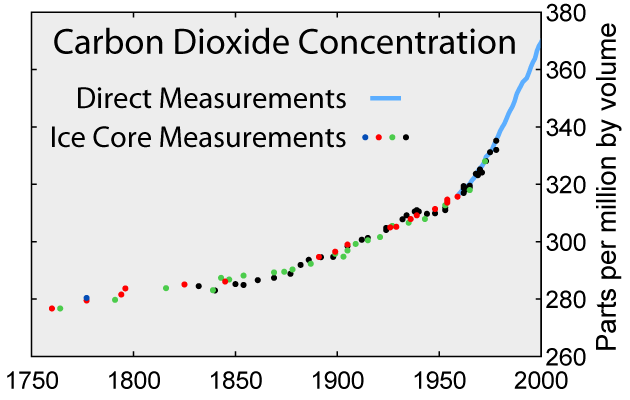
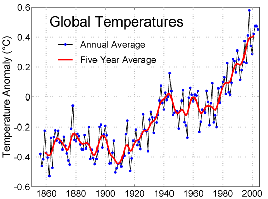
These graphs show how carbon emissions, atmospheric concentrations of carbon dioxide, and global average temperatures have changed in recent times.
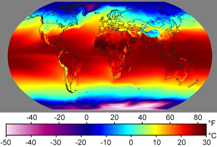
This image shows sea surface temperatures (SST) averaged over a whole year (in this case, 2001). Notice how temperatures range from freezing (0° C or 32° F) near the poles to around 30° C (about 86° F) in the tropics.
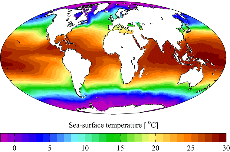
Credits: Image courtesy of Plumbago via Wikipedia, using data from the World Ocean Atlas 2001. |
Here is Earth's surface air temperature in recent times. This image shows average temperatures for the period from 1961 to 1990.
Credits: Image courtesy of Robert A. Rhohde and the Global Warming Art project. |
Average Global Temperature 1940-2005 |
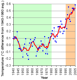 |
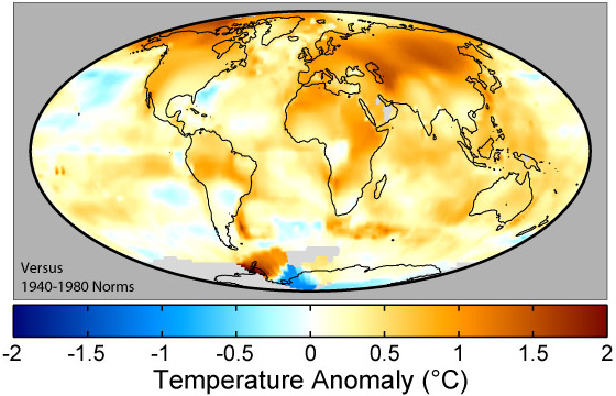
| All values are in comparison to 1940-1980 average (green shading). Map at left shows 1995-2005 averages (the orange shaded region on the graph above). Blue points and lines on the graph are annual values; the red line is the 5-year smoothed average. |
This map (above) shows recent changes in Earth's surface air temperatures. The colors indicate the temperatures in the decade around 2000 as compared to average values from about 40 years earlier. Specifically, the colors compare average temperatures during the years 1995 through 2004 versus the averages from 1940 through 1980. The global averge temperature increased about 0.42° C during this time.
Credits: Map image courtesy of Robert A. Rohde and the Global Warming Art project. Graph is original artwork by Windows to the Universe staff (Randy Russell) using data from NOAA. |
Use the popup menu in the upper left corner of the interactive below to select a map to view. Choices include contemporary global surface air temperature and sea surface temperature, changes in temperature by 2000, and four climate model projections for possible future climate in 2025 and 2095.
Compare maps side-by-side using the viewer below.
You might also be interested in:
Leaders from 192 nations of the world are trying to make an agreement about how to limit emissions of heat-trapping greenhouse gases, mitigate climate change, and adapt to changing environmental conditions.
...more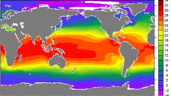
Climate in your place on the globe is called regional climate. It is the average weather pattern in a place over more than thirty years, including the variations in seasons. To describe the regional climate
...more
Less than 1% of the gases in Earth's atmosphere are called greenhouse gases. Even though they are not very abundant, these greenhouse gases have a major effect. Carbon dioxide (CO2), water vapor (H2O),
...more
Television weather forecasts in the space age routinely feature satellite views of cloud cover. Cameras and other instruments on spacecraft provide many types of valuable data about Earth's atmosphere
...more
Predicting how our climate will change in the next century or beyond requires tools for assessing how planet responds to change. Global climate models, which are run on some of the world's fastest supercomputers,
...more
The world's surface air temperature increased an average of 0.6° Celsius (1.1°F) during the last century according to the Intergovernmental Panel on Climate Change (IPCC). This may not sound like very
...more
A factor that has an affect on climate is called a forcing. Some forcings, like volcanic eruptions and changes in the amount of solar energy, are natural. Others, like the addition of greenhouse gases
...more


