
Where are we now? Climate "Today"
Before we move on to projections of how our planet's climate will likely change in the future, let's take a few looks at the current state of Earth's climate and how climate changed during the past century or so.
Global climate is warming
These graphs show how carbon emissions, atmospheric concentrations of carbon dioxide, and global average temperatures have changed in recent times.
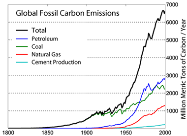 |
Total global carbon emissions (black line) have increased since the start of the Industrial Revolution in the Mid- Nineteenth Century. Coal (green line) was much more widely used during the first half of the 20th Century than petroleum or natural gas. It powered the many inventions developed at the time and it was widely used in furnaces to heat homes. Natural gas (red line) became more widely used after World War II when pipelines were built. The use of petroleum increased dramatically (blue line) after the discovery of enormous oil fields in the rocks under Saudi Arabia and Kuwait. |
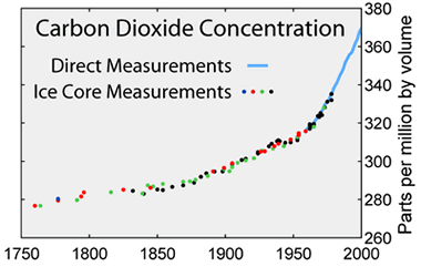 |
Carbon dioxide concentrations have increased since the start of the Industrial Revolution as more carbon has been emitted into the atmosphere. Note that the x-axis for this graph stretches back to 1750, a half century before the above. The data used to make this graph comes from ice cores and direct measurements. (Check into the readings from last week for more about how these data are collected!) |
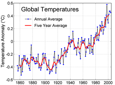 |
Global average temperature has increased as carbon dioxide and other heat-trapping greenhouse gases have been added to the atmosphere. During the 20th Century, global average temperate has increased 0.6 degrees Celsius (1.1 degrees Fahrenheit). Note that this graph starts at about 1855. This is as far back as we have good direct measurements of global temperature. |
Change in temperature hasn't been the same everywhere
While global average temperature has increased over the past century, the rate of warming has not been the same everywhere. The map below indicates that much of the high latitudes in the Northern Hemisphere and the Antarctic Peninsula have warmed more in recent decades than other places. We will explore regional impacts of climate change further next week.
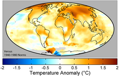 |
This map shows recent changes in Earth's surface air temperatures. The colors indicate the temperatures in the decade around 2000 as compared to average values from about 40 years earlier. Specifically, the colors compare average temperatures during the years 1995 through 2004 versus the averages from 1940 through 1980. The global average temperature increased about 0.42° C during this time. Map image courtesy of Robert A. Rohde and the Global Warming Art project. |
The above was designed for the ASTC C3 Climate Change online course for educators. Please visit NCAR Online Education for more information about our suite of courses.