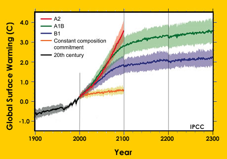
Earth's average temperature over the past 100 years is shown in the black line. Predictions of the amount of warming in the future are shown by the red, green, and purple lines. These predictions, developed with computer models, make different assumptions about how many greenhouse gases we release into the atmosphere in the future.
A Windows to the Universe image based on a graph from the IPCC 4th Assessment Report