

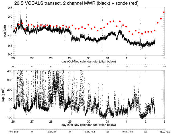
Image courtesy of Paquita Zuidema. | ||||
| ||||
You might also be interested in:
Traveling Nitrogen Classroom Activity Kit
Check out our online store - minerals, fossils, books, activities, jewelry, and household items!...more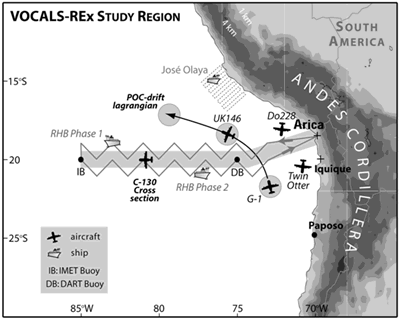
What are the results of VOCALS?
Long after the VOCALS campaign is completed, the scientists work will continue. They must process, review, and study the data to determine what has been learned. Many model runs will be made and analyzed....more
How Clouds Form
A cloud is composed of tiny water droplets or ice crystals that are suspended in the air. A series of processes have to happen in order for these water droplets or ice crystals to form into clouds in the...more
Electromagnetic Radiation
Electromagnetic radiation is the result of oscillating electric and magnetic fields. The wave of energy generated by such vibrations moves through space at the speed of light. And well it should... for...more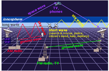
Radio Waves
Radio waves are a type of electromagnetic radiation. A radio wave has a much longer wavelength than does visible light. We use radio waves extensively for communications. Radio waves have wavelengths as...more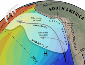
Winds in the Southeast Pacific
Winds in the Southeast Pacific have a strong influence on regional climate and play an important role in several large-scale, global climate phenomena. The Hadley cell is a global atmospheric circulation...more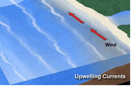
Ocean-Atmosphere Coupling in the Southeast Pacific
The ocean and the atmosphere in the Southeast Pacific Ocean are connected in many ways. Strong trade winds blow northward along the west coast of South America. These winds stir up the ocean, bringing...more
Rhea George
Many students in atmospheric science were motivated to enter the field by some fascinating extreme weather event experienced as a child. This was not the case with me. When I was an undergraduate I was...morePlease log in
Science Blogs
Real Climate: climate science from climate scientists

Windows to the Universe, a project of the National Earth Science Teachers Association, is sponsored in part is sponsored in part through grants from federal agencies (NASA and NOAA), and partnerships with affiliated organizations, including the American Geophysical Union, the Howard Hughes Medical Institute, the Earth System Information Partnership, the American Meteorological Society, the National Center for Science Education, and TERC. The American Geophysical Union and the American Geosciences Institute are Windows to the Universe Founding Partners. NESTA welcomes new Institutional Affiliates in support of our ongoing programs, as well as collaborations on new projects. Contact NESTA for more information.
