
Name________________________
Changing Planet: Sea Levels Rising
Part I – A Review of
Topographic Maps
Background
A topographic map is
often a very large-scale map that shows the shape of the land's surface.
Contour lines are imaginary lines that connect places of equal elevation. If
you were taking a hike along a hillside and not walking either uphill or
downhill, you would be walking on a contour line. Your teacher will have given
you a deli tub container containing a potato in it. Make sure you have the
following supplies and then follow the directions below.
Materials per student
One deli tub containing cut and
marked potato
One
lid to place on top of the deli container
One
dry erase marker
Metric
ruler
Procedure
- Use your dry erase marker
to carefully mark a scale on the side of the plastic tub using rulers to
indicate one centimeter increments. Start with 0 cm.
- Place the container
lid on the deli tub. Look straight down into the tub and draw a north arrow and
other three cardinal directions (based on the directions marked on the potato).
Also, draw a circle around the rim of the tub.
- Remove lid and add
blue water carefully until the level reaches the two centimeter mark on the
side of the tub. Be careful to not pour the water directly on the potato.
Instead pour it towards the side of the tub.
-
Replace the lid and orient it with the north arrow on the potato. Draw a
line where the water meets the potato. This is the shoreline. Looking
straight down and closing one eye helps when drawing the shoreline and future
contour lines.
- Repeat
steps 3 and 4 until there are several contours at one centimeter increments and
the potato is submerged. Mark the contour interval (vertical distance between
contours) on the lid (C.I.=1 cm)
- Remove the lid of the
container and place against a white piece of paper to see the resulting contour
map of your potato island clearly.
Analysis
Please answer the following questions:
- What features of your potato does
your topographic map show? Are there features that are missed? Write a
hypothesis about how your topographic map would change if you had mapped
contour interval = 0.5 cm.
- Which quadrant of your potato is
the steepest? For example, it might be between North and East or between South
and West. What do you notice about the contour lines for this quadrant?
- Compare your
map/potato results with two other students. Do all the potatoes have similarly
shaped contours? Share any differences here.
- Explain one
recreational use where it would be useful to have access to a topographic map.
Explain one professional use where it would be useful to have access to
topographic maps.
- Discuss any
limitations of topographic maps that you can see. What features would be
missed if you were just given contour lines to view?
Background
Sea
level change has happened at various times in Earth history. Global sea level
can rise because glaciers melt, adding water to the oceans, or when plate
tectonic movements diminish the ocean basins displacing water onto the edges of
continents. It is a natural process that has gone on since there have been oceans
on Earth. One thing is certain - global warming is now causing a rapid rise in
sea levels. How does global warming cause sea level to rise? There are two
reasons. First, when climate warms, water that is on land in glaciers and
ice sheets melts and makes its way down rivers to the ocean. Second, as
seawater warms up, the water molecules move further apart causing the water to
expand. Scientists suspect that this expansion of seawater accounts for
more than half the amount of sea level rise we see today.
The
actual distance that seawater comes onto land is dependent on many factors
including the shape of the land, type of land and amount of erosion, local
ocean currents, and tides. There will be many social, economic, political and
ecological repercussions of the rapid rise in sea level caused by global
warming.
Part II – A Look at the
Issue of Rising Sea Levels
Materials per student
Computer/internet access
Colored pencils
Procedure and Analysis
Open this NASA web page on
your computer. Use the graphs and time series to answer the following
questions. Graphs and images are listed for reference purposes only. They are
updated regularly on the web sites listed and they are interactive – please
access current graphs and time series on the internet.
http://climate.nasa.gov/keyIndicators/index.cfm#SeaLevel
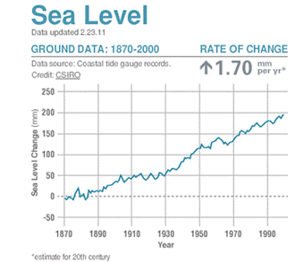
- Using the graph
titled Ground Data: 1870-2000 (example graph shown above), calculate the amount
in mm that sea level rose from 1870-2000. _____________________
- What is the
estimated rate of change of sea level listed on the graph during the time
period of 1870-2000? __________________________
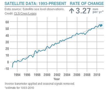
- Using the graph
titled Satellite Data: 1993-Present (example graph shown above), calculate the
amount in mm that sea level rose from 1993-present. ___________________
- What is the estimated
rate of change of sea level listed on the graph during the time period from
1993-present? ____________________
- Which time period has
the highest rate of sea level change? Does it appear that sea level rise is
increasing or decreasing?
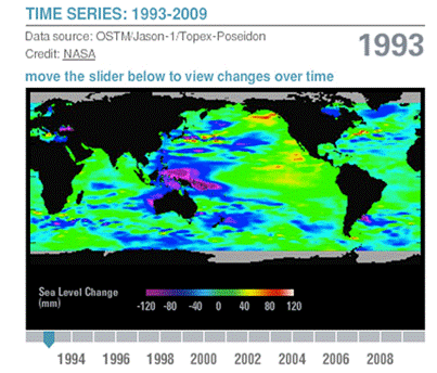
- Take a minute or two
to familiarize yourself with the Sea Level - Time Series from 1993-2009
(example series shown above). Use this tool to complete the table below. Look
at the Time Series on each of the years listed (and those in between for
reference). Approximate how much of the world’s ocean is below normal
sea level for each year, how much of the world’s ocean is at normal sea level
for each year, and how much of the world’s ocean is above normal sea level for
each year. The total of these three percentages should equal 100%. For
example, if you look at 2009, approximately 10% of map is below normal sea
level (Blue, Purple), 60% is at normal sea level (Green), and 30% looks to be
above normal sea level (Yellow, Orange, Red). The total estimated percentages
add up to 100%.
|
|
%
Below Normal Sea Level (Blue, Purple)
|
%
Normal Sea Level (Green)
|
%
Above Normal Sea Level (Yellow, Orange, Red)
|
|
1993
|
|
|
|
|
1996
|
|
|
|
|
1999
|
|
|
|
|
2002
|
|
|
|
|
2005
|
|
|
|
|
2008
|
|
|
|
- Now turn this table
into a bar graph with the three percentages for each year listed on the x-axis
and percentages (0-100%) listed on the y-axis. Draw the Below Normal % bar in
Blue, the Normal Sea Level % in Green, and the Above Sea Level % in Red – this
should be done and grouped together for each year.
- What trend do you see
in the rise of sea level above normal for the time period 1993 to 2008? Use
your bar graph and data to explain your answer.
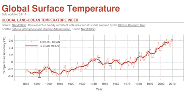
- Looking further down
the page at the section called Global Surface Temperature (example graph shown
above), estimate using the 5 Year Mean line, the amount temperature has risen
in degrees Celsius in the time period from 1993-2008.
- Is temperature rise from 1993-2008
directly or inversely correlated to sea level rise during the same time
period? Explain.
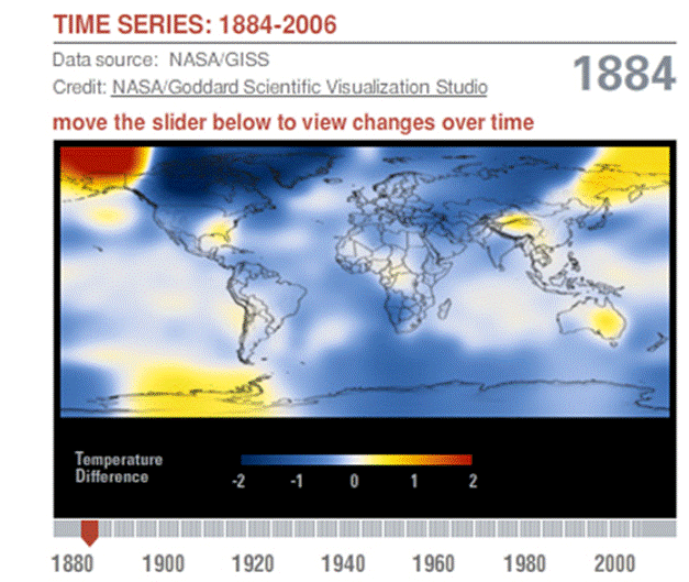
- Use the Global Surface Temperature -
Time Series to answer these questions (example series shown above). In 1884,
the predominant color shown on the map is ________, noting a warmer/cooler
(circle one) temperature than normal. In 1940, the following new colors appear
on the map _____________, noting a warmer/cooler (circle one) temperature than
normal. Now look at the map for 2006 and tell what is different from that map
from the maps in 1884 and 1940. Explain what the colors on the 2006 map tell
us.
It is clear at this point in the exercise
that Global surface temperature has been rising drastically since around 1940.
Sea level has been rising as well in that time period. Let’s look at why that
is! Look at the Carbon Dioxide Concentration section to answer the following
questions.
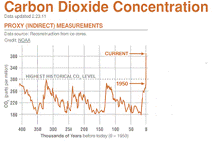
- Look at the Proxy (Indirect)
Measurements Graph (example graph shown above). Look at the graph to see how
CO2 levels have changed for many of thousands of years before "today" (1950).
The graph ranges back 400,000 years. What is the highest historical level of
CO2 shown on the graph in ppm? ___________________
What is the level of CO2 in 1940 in ppm?
___________ What is the level of CO2 in 1950 in ppm? __________ And what is
the level of CO2 in ppm currently? __________
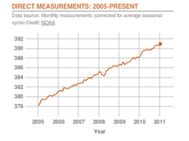
- Look at the Direct Measurements:
2005-Present graph to answer the following questions (example graph shown
above). How much have CO2 concentrations risen between the first measurement
of 2005 and the latest measurement? ______________ Are CO2 concentrations
directly or inversely correlated with global surface temperature? ____________
Is global surface temperature directly or inversely correlated with sea level
rise? _________________________
- Read "What Does This Mean?" It states
that CO2 is naturally occurring in Earth’s atmosphere, but that through human
activities, we are adding more CO2 to the Earth’s atmosphere. Human activities
that are currently causing global warming include burning fossil fuels like
coal, oil, and gas. Burning these fuels releases greenhouses gases like CO2
into the atmosphere and more greenhouse gases causes Earth's greenhouse effect to
grow stronger, warming the climate. Changes in the way land is used also have
an impact on climate. For example, when trees and other plants are cut down to
make way for new buildings or parking lots, climate warms because less carbon
dioxide is taken out of the atmosphere without the plants.
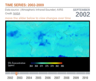
Explore the CO2 Concentration Time Series:
2002-2009 (example series shown above). Does it validate the paragraph above?
Explain.
- It is clear that rising greenhouse gases
like CO2 have been causing increased global surface temperature. Sea levels
seem to rise with rising global surface temperature. Brainstorm ideas that
you, your family, your class and your school could do to limit greenhouse gas emissions
(remember: every time you use electricity, the energy behind that came from
fossil fuels!). This is also called becoming carbon neutral or reducing your
carbon footprint.
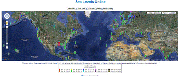
Open this NOAA web page on
your computer (shown above). Take a few minutes to familiarize yourself with
the Sea Levels Online Map. Click on different components of the map to see the
data available. Be sure to click on different colored arrows, move the map
around by clicking and dragging the mouse, and zoom in and out using scale to
the left side of the map. Answer the following questions.
http://tidesandcurrents.noaa.gov/sltrends/sltrends.html
- Find the arrow closest to where you live
(you may need to zoom in on the map to find this). If you live very far
inland, still find the arrow on the coast that is closest to where you live.
By holding the mouse over the arrow, note the name of the location of the arrow
and the mean sea level trend (given in mm rise or fall per year). Now click on
the arrow. At the end of the text found by clicking on the arrow, it tells you
the change in sea level in 100 years. Note this information as well.
Name of location: _____________________
Mean sea level trend in mm/year:
___________________
Change in sea level in 100 years in
feet/century: ______________
Note that this information should match the
Sea Level Trends Key at the bottom of the map where you can tell if a location
has increasing sea level by looking at the color and height of its arrow and
what range the increase is in (colored boxes) and that Key also tells you the
range for rise in sea level (feet/century).
What color arrow did you click on and what
was they key’s range for this color?
___________________________________________________
Is sea level rising or falling near where you
live? __________________
- Now find two locations in the United
States that have red or orange arrows. Note the following information about these
locations.
Location #1: ______________________________
Mean sea level trend in mm/year:
___________________
Change in sea level in 100 years in
feet/century: ______________
Location #2: ______________________________
Mean sea level trend in mm/year:
___________________
Change in sea level in 100 years in
feet/century: ______________
These locations are places where sea level is
rising quickly and where the sea level has risen a lot in the last century.
These are places where we already need to focus our energy on making sure
people, buildings, natural resources and infrastructure are safe from rising
sea levels. You will have a chance to explore this more in Part III.
- Click on the global
button at the top of the map. Note three spots that are not in the U.S. where
sea level is rising quickly (hint: look for yellow, orange or red arrows).
Location #1:
______________________________
Mean sea level trend in mm/year:
___________________
Change in sea level in 100 years in
feet/century: ______________
Location #2: ______________________________
Mean sea level trend in mm/year:
___________________
Change in sea level in 100 years in
feet/century: ______________
Location #3: ______________________________
Mean sea level trend in mm/year:
___________________
Change in sea level in 100 years in
feet/century: ______________
Are there any similarities that these
locations share in location or climate?
- On the global scale, which areas are
not "in trouble". Note at least three areas where sea level is falling (hint:
look for blue, pink or purple arrows).
Location #1:
______________________________
Mean sea level trend in mm/year:
___________________
Change in sea level in 100 years in
feet/century: ______________
Location #2: ______________________________
Mean sea level trend in mm/year:
___________________
Change in sea level in 100 years in
feet/century: ______________
Location #3: ______________________________
Mean sea level trend in mm/year:
___________________
Change in sea level in 100 years in
feet/century: ______________
Are there any similarities that these
locations share in location or climate?
- The Changing Planet Movie on Rising Sea
Levels mentioned a number of large cities in the U.S. that are coastal
communities. If sea level rises around these cities, they will be threatened
with greater storm surge, flooding, coastal erosion, and displacement of
people/buildings. Choose one of the following cities and use the Sea Levels
Online Mapping Tool to write a letter to the editor of the city’s major
newspaper saying whether or not the city should be worried about rising sea
levels. Choose from: Boston,
New York City, Washington, DC, Miami, New Orleans, and Los Angeles.
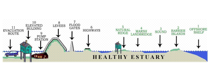
Part III – Community
Examples and Repercussions of Rising Sea Levels
You
saw in Part II of this exercise that sea levels (and change of sea level) are
not uniform across the globe. Nor would a given sea level rise affect all
coastal areas in the same way – much depends on the geological and geophysical
properties of the specific area. An example of sea level rise is that an
estimated 55 cm sea level rise in the area of Louisiana, U.S., would equate to
a loss of at least 25 miles of coastline (more along river deltas). Much of
coastal Louisiana is actually located below sea level right now, but some areas
are protected by 10-15 feet high levees that are 300 feet wide at their base.
Estimates for other areas suggest that 1 cm of sea level rise would equal
approximately 1 meter of land lost. Again, sea level rise will affect each
place differently - places that are flat (like Florida) would lose more land
than places that have steep landforms. In the following exercise, you will be
told how much land will be lost for each community.
Materials per student
Colored
pencils
Procedure and Analysis
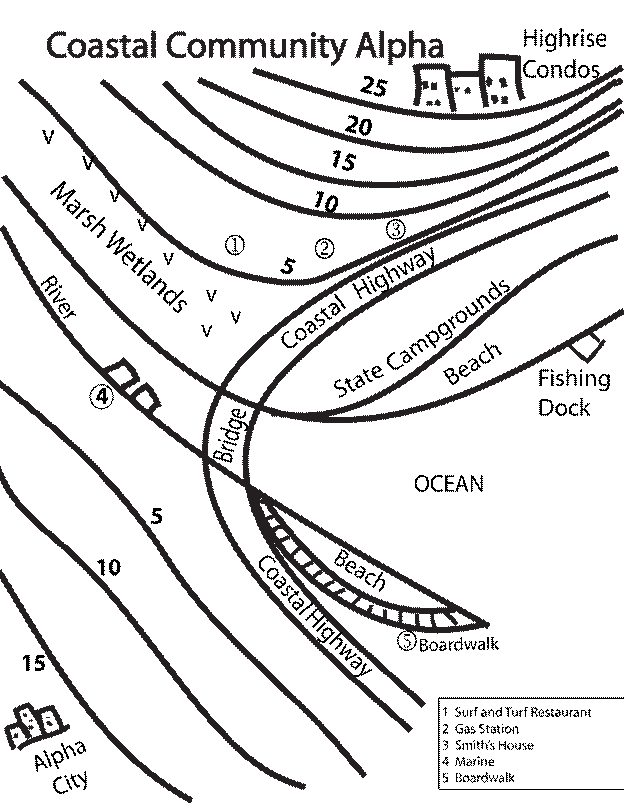
Alpha
Scenario 1
- Mark the coastline
where water meets land with two dark blue lines (your lines can follow all the
way along the riverbanks).
- Assume the year is
now 2021 and sea level has risen dramatically in coastal community Alpha.
Water now reaches to the 5-foot contour line. Color the area now underwater
solid blue and draw a new dark blue line for the new coastline.
- What human
establishments were affected by this rise in sea level? What social
implications would this rise in sea level have?
- Would the Coastal
Highway be usable in this scenario? Why or why not?
- What natural
resources were affected by the higher sea level (think of what plants, animals
lived in the coastal environments shown)?
- Was the economy of
the area affected?
Scenario 2
- Assume the year is now 2041 and sea level has risen even
more dramatically. Water now reaches the 10-foot contour line. Color the area
now underwater solid blue and draw a new dark blue line for the new coastline.
- What human
establishments were affected by this rise in sea level? What social
implications would this rise in sea level have?
- What natural
resources were affected by the higher sea level (think of what plants, animals
lived in the coastal environments shown)?
- Was the economy of
the area affected?
- What areas were
spared by the sea level rise?
Scenario 3
- Assume the year
is now 2071 and sea level has risen even more dramatically. Water now reaches
the 20-foot contour line. Color the area now underwater solid blue and draw a
new dark blue line for the new coastline.
- What human
establishments were affected by this rise in sea level? What social
implications would this rise in sea level have?
- What natural
resources were affected by the higher sea level (think of what plants, animals
lived in the coastal environments shown)?
- Was the economy of
the area affected?
- Can you think of
a way to make the highway usable, that is, to keep water away from the highway
(be creative – engineers certainly have to be these days!)?
- This is an actual
Multiple Line of Defense used by Coastal Louisiana. Its implementation has
been greatly accelerated given the Hurricanes Katrina and Rita. (Access http://www.mlods.org/ for more information).
Discuss the merits of a defense such as this:
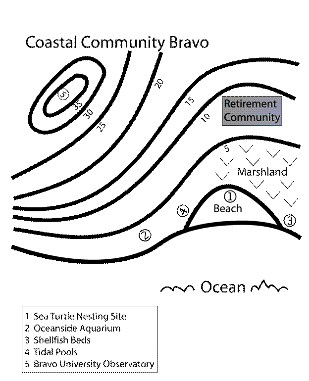
Bravo
Scenario 1
- Mark the coastline where water meets land
with a dark blue line.
- Assume the year is now 2021 and sea level
has risen dramatically in coastal community Bravo. Water now reaches to the
5-foot contour line. Color the area now underwater solid blue and draw a new
dark blue line for the new coastline.
- What human
establishments were affected by this rise in sea level? What social
implications would this rise in sea level have?
- What natural
resources were affected by the higher sea level (think of what plants, animals lived
in the coastal environments shown)?
- Was the economy of
the area affected?
Scenario 2
- Assume the year is now 2071 and sea level has risen even
more dramatically. Water now reaches the 25-foot contour line. Color the area
now underwater solid blue and draw a new dark blue line for the new coastline.
- What human
establishments were affected by this rise in sea level? What social
implications would this rise in sea level have?
- What natural
resources were affected by the higher sea level (think of what plants, animals
lived in the coastal environments shown)?
- Was the economy of
the area affected?
- What establishment
was spared by the sea level rise?
- Community Alpha and Bravo are made up
communities, but sea level rise has real implications. Give an example of a
coastal community you have visited and tell how a rise in sea level would have
affected the area you visited. List examples of what sorts of things would
have been affected even by a modest sea level rise.
Application and Extensions
– Optional (Your Teacher Will Assign These or Not)
- Some of the many
problems that come with sea level rise are massive population migrations,
conflicts because of social or economic reasons, disease spread (as people move
and carry native diseases with them), and natural destruction like coastal
erosion, contamination of freshwater supplies or destruction of wetlands. Sea
level rise also means that engineering structures like levees, sand barriers,
sea walls, and other defenses have to be in place and maintained. Much
research is needed to come up with new, sustainable ways to protect people,
their possessions, and natural resources. Choose one of these topics (or
another rising sea levels topic of interest) to research in more depth and
prepare a short presentation to share with your class. Clear your chosen topic
with your teacher beforehand.
- There are particular low-lying locations
in the world that scientists are worried about with regards to sea level rise.
Choose one of the locations and research to see if preparations are being made
to guard against the rise of sea level and what local issues make these
locations a concern. Choose from the Gulf Coast of U.S., Florida in the U.S.,
Nile Delta, Bangladesh, Maldives and Coastal China. Use the NOAA Sea Levels
Online site in more depth to help you with your research. There is much more
data available through that web site that can be found by clicking on the links
for a given location (arrow) that you’ve chosen.
The source of this material is Windows to the Universe, at http://windows2universe.org/ from the
National Earth Science Teachers Association (NESTA). The Website was developed in part with the support of UCAR and NCAR,
where it resided from 2000 - 2010. © 2010 National Earth Science Teachers Association. Windows to the Universe® is a registered trademark of NESTA. All Rights Reserved.
Site policies and disclaimer.