
ExploraTour On-Line Expedition: A Peek into the Lives of the Stars
What is Plotted on the Horizontal Axis?
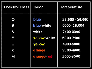
The spectral class is plotted across the bottom of the HR diagram. It is a code that tells us the color and temperature of stars. The table gives the colors and temperatures for each spectral class. These temperatures are shown at the top of the HR diagram.
Temperatures get cooler as you move across the HR diagram from left to right.
The background is shaded to crudely give some idea of the colors associated with these temperatures going from blue (hottest) to red (coolest).