Climate Model "Test Drive"
Later in this week you will try out a couple of possible future climate scenarios using a very, very simple climate model. Let's take a quick "test drive" of that simple model now. Hopefully, this introduction to the model will help you think about possible scenarios as you work through this week's readings, and may help you focus on aspects of those readings that apply to this exercise.
This climate model is very basic, and is very much under development still (lots of rough edges!). This model calculates expected atmospheric concentrations of CO2 and expected average global temperatures. You must provide the model with rates of CO2 emissions as an input; in other words, you must tell the model how much CO2 you think humans will release into the atmosphere at various times in the future.
We'll first explain how to run the model and how to read the results; then we'll give a bit more background about the assumptions (and the math) behind the model.
Let's start with a very simple case. Let's assume that our emissions of CO2 do not change over time and are basically "frozen" at the rate we were emitting in the year 2000. That rate was around 6 gigatons of carbon per year (6 GtC/yr). Let's see what happens in the future according to this model given a fixed rate of emissions.
The model appears below. Use the controls along the left side of the model to run it as follows:
- Using the popup menu, make sure the "CO2 emissions" rate is set to 6 GtC (it should be already set to 6 as the default).
- Set the "Timestep size" to 10 years using the popup menu. This means that every time we tell the model to advance, it will move ahead 10 years of "model time".
- Click the "Step Forward" button. You should see three points appear on the graph (the red point is partly covering up the black one) above the year 2010.
- Click the "Step Forward" button several more times, until you've filled out the graph to the year 2100.
- Once you've completed these steps, continue reading the text below the model.
The Very, Very Simple Climate Model
| Do you need to download this interactive for use "offline" (that is, on a computer that doesn't have Internet access or at least not reliable access)? If so, use this link to download it. (On a Windows PC, right-click on the link, then "Save as..." to save the file to your local hard drive; on a Macintosh computer, hold down the Control key while clicking the link, then "Save as..."). |
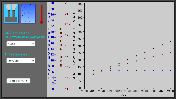
OK, if things went well for you your graph should look like the screenshot below:
What is this graph showing us?
- The blue points (and blue y-axis scale) represent the emission rate of CO2 in GtC per year. Since we kept that value constant at 6 GtC throughout, the blue dots trace a horizontal line on our graph.
- Black dots (and corresponding y-axis scale) represent atmospheric concentration of CO2. Units are "parts per million by volume" (ppmv). For reference, the actual concentration was around 368 ppmv in the year 2000. In this run, the concentration rises from around 400 ppmv to over 600 ppmv by the year 2100.
- The blue dots (emission rate) represent how much carbon we add to the atmosphere each year; the black dots (concentration) represent how much carbon has accumulated in the atmosphere over time. As you can see here, adding CO2 at a steady rate causes the concentration to steadily climb (sort of like running water into a bathtub at a steady rate... it eventually fills up!).
- Red dots (and corresponding y-axis scale) represent average global temperature in degree Celsius. For reference, this value was around 14.3° C in the year 2000. In this model run, the temperature steadily rose to about 17.5° C by the year 2100. In this simple model, the temperature is determined entirely by the atmospheric CO2 concentration via greenhouse warming of the atmosphere.
Let's do another run of the model with a different scenario. You will need to use your web browser's "Reload" or "Refresh" button to reload this web page and thereby reset the model (sorry, a "Start Over" button is near the top of my list of improvements for the model, but I haven't had a chance to get to that yet). Once you have a "clean slate", run the model as follows:
- We'll now do a run that is a hopeful but realistic scenario. Carbon emissions will rise through the middle of the 21st century, and then decline after that.
- Set the timestep size to 10 years, as before.
- Also as before, start with carbon emissions set at 6 GtC/yr.
- Click the "Step Forward" button once to advance "model time" by 10 years to 2010.
- Increase emissions by 1 GtC/yr (to 7 GtC/yr) and advance another 10 years.
- Keep increasing the emission rate by 1 GtC/yr (to 8, 9, ...) for each time step and then advancing the model by 10 years using the "Step Forward" button.
- Once you reach the year 2050 (and an emission rate of 10 GtC/yr), start decreasing the emission rate by 2 GtC/yr for each new timestep (to 8, 6, 4, etc.).
- Run the model to the year 2100.
Your graph should look like the screenshot below:

Some things to note:
- In this run, emissions (blue) increased until 2050, then steadily decreased to zero by 2100.
- CO2 concentration in the atmosphere (black) continued to rise even as emissions dropped; we were still "pouring water into the tub", just at a slower rate. The concentration curve rises more slowly in the latter half of the century as emissions drop, and levels off around 650 ppmv when emissions drop to zero in 2100.
- Temperature (red) follows a trend similar to that for CO2 concentration; continuing to rise even as emissions drop, but at a slower pace. In this run, the temperature plateaus around 17.5° C in 2100.
OK, let's do one last run of the model with a third scenario. Reload/Refresh the web page to reset the model. Once you have a "clean slate", run the model as follows:
- We'll now do a run that represents a more pessimistic scenario. Carbon emissions will rise steadily throughout the 21st century. What do you expect CO2 concentration and temperature to do?
- Set the timestep size to 10 years, as before.
- Also as before, start with carbon emissions set at 6 GtC/yr.
- Click the "Step Forward" button once to advance "model time" by 10 years to 2010.
- Increase emissions by 1 GtC/yr (to 7 GtC/yr) and advance another 10 years.
- Keep increasing the emission rate by 1 GtC/yr (to 8, 9, ...) for each time step and then advancing the model by 10 years using the "Step Forward" button.
- Run the model to the year 2100.
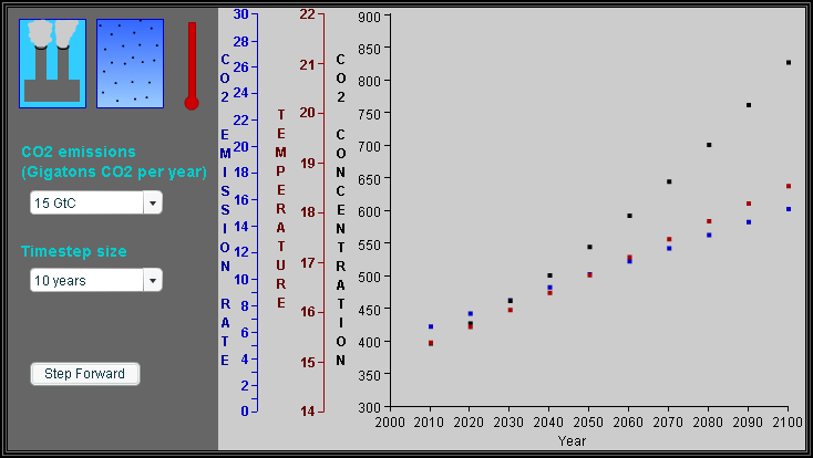
Your graph should look like the screenshot below:
What happened?
- Emissions (blue) rose steadily to 15 GtC/yr in 2100, as can be see in the sloping line of blue dots.
- Atmospheric CO2 concentration (black) rose as well, peaking somewhere over 800 ppmv by 2100. Note how the curve of black dots bends upward toward the right. A linear increase in emissions produces a roughly exponential growth rate in concentration.
- Temperatures (red) also rose steadily to to about 18.5° C by 2100. Note that the temperature curve, unlike the concentration curve, does not bend upward at the right end. More on that later!
Enough playing with models for now! We will come back to this after some readings, and will ask you to choose your own scenarios to experiment with then. Please keep that in mind as you progress through the readings.
Some Notes About This Model
"All models are wrong, but some models are useful." - George E.P. Box
- A major educational point embodied in this model is that temperatures depend on concentration, which rises whenever emissions are greater than zero. You've probably heard sound bites along the lines of "we are working hard to reduce the rate of growth of greenhouse gas emissions", presented as if such an approach would eventually lead to reduced temperatures.
- This model is very, very simple. It knows nothing of changing wind or precipitation patterns that might accompany and in turn influence warming; it doesn't care where in the atmosphere the CO2 is; it ignores other greenhouse gases; and so on.
- The assumptions behind this model, though rather limited, are valid as far as they go. The starting values for concentration, emission rate, and temperature are right around actual values for the year 2000. The ranges for emission rate choices are in line with predictions scientists think we are likely to see in the coming century. The relationship between atmospheric CO2 concentration and temperature uses a well-established relationship; basically, temperature rises about 3° C for each doubling of CO2 concentration. So, for example, if the concentration goes from 400 ppmv to 800 ppmv, we expect to see temperature go up by 3° C.


