
Modeling Future Climate on a Regional Scale
Some regional aspects of climate change apply to classes of regions that are found various places around the globe; others apply to specific places. Examples of the former include: land vs. ocean, at high latitudes vs. the tropics, islands, or near coasts vs. near the center of a continent. Specific places include northern Europe, western North America, the Amazon region of South America, and so on.
We'll first look at predicted trends in future climate associate with classes of regions. Then we'll examine projections for climate in specific locales.
Regional Climate Predictions: Classes of Regions
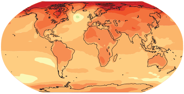
The images below show forecasts of future temperatures as predicted by climate models. The colors on the maps indicate expected temperature changes as compared to average temperatures for the period from 1980 to 1999. Green and yellow indicate smaller temperature increases, while red and purple indicate larger increases. Each map represents averages for several different climate models combined. The two maps on the left show projections for years 2020 to 2029. The maps on the right show projections for the years 2090 to 2099. Results based on two different "input scenarios" are shown. The top row shows projections based on the IPCC's B1 scenario. B1 is a relatively optimistic and "green" scenario in which population growth is low, economic and technological advancement rate is high, and energy use is low; annual carbon emission rates peak at 11.7 GtC (gigatonnes carbon) around 2040, and drop to 5.3 GtC (below 1990 emission rates) before 2090. The lower pair of images shows projections based on the IPCC's A2 scenario. A2 is a relatively pessimistic scenario in which population growth is high, technological change and economic growth is slower and more disparate (between countries and regions) than in other scenarios, and that energy use is high. In the A2 scenario, carbon emission rates reach 16.1 GtC by 2040, and continue rising to 26.2 GtC per year by 2090. Let's see what general trends these projections indicate for regional changes to climates.
Years |
||
2020-2029 |
2090-2099 |
|
| Scenario B1 | 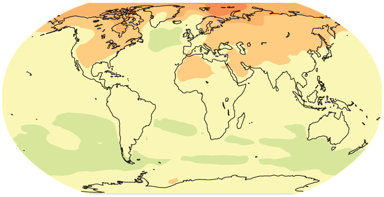 Avg. Global Temp = 0.76° C above 1980-1999 |
 Avg. Global Temp = 1.85° C above 1980-1999 |
| Scenario A2 | 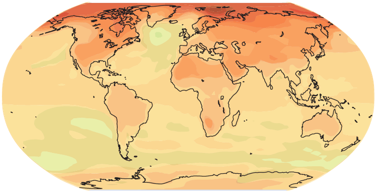 Avg. Global Temp = 0.77° C above 1980-1999 |
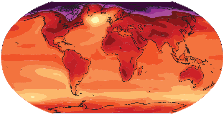 Avg. Global Temp = 3.34° C above 1980-1999 |
 |
||
Look at the four maps and consider whether you see any general trends with regards to the following considerations:
- Will there be more warming over oceans or over land, or will land and sea heat equally?
- Is the projected temperature increase the same at all latitudes, or is there some difference between the tropics, mid-latitudes, and/or polar regions?
- Is the temperature rise in the Southern Hemisphere likely to be similar to or different from the change in the Northern Hemisphere?
- Will coastal regions or areas that are far inland on continents warm more? Or will coasts and landlocked regions warm by similar amounts?
Take a look at the maps above in light of these questions; then read on. As you can probably see for yourself, there are certain regional trends climate modelers expect to observe as the overall climate warms:
- The oceans, due to the vast thermal inertia of the water in them, are expected to warm more slowly than land.
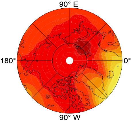
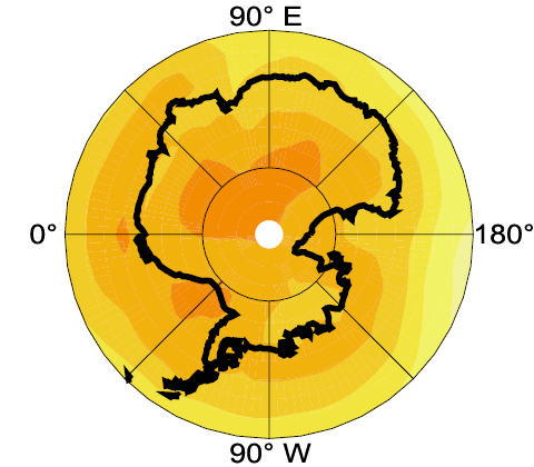
- High latitude regions, especially in and around the Arctic, will warm more than places closer to the equator. Climate scientists generally expect the Arctic to heat up about twice as quickly as compared to the global average temperature (for example, if the average global temperature rose 2°, we should expect temperatures in the Arctic to rise about 4°). Climate change to date has indeed demonstrated this trend predicted by modelers; observed heating in the Arctic has outpaced average global warming.
- In general, regions in the middle of continents are expected to warm more dramatically than coastal areas. Of course, specific regional topography such as mountain ranges or deserts will influence this overall trend.
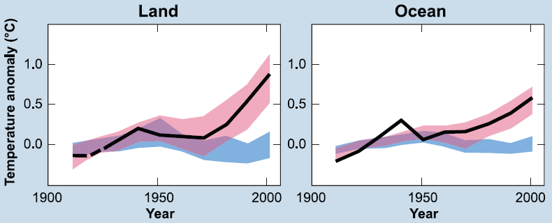
Changes to global average surface temperatures during the 20th century. The graph on the left shows changes to temperature over all land surfaces combined; the right-hand graph shows changes over all of the oceans. The solid black lines show decadal averages of actual observed temperature trends. Temperatures over land increased by a larger amount than temperatures over the oceans. Climate modelers expect this difference in land vs. sea heating to continue in the future. The temperatures shown are in comparison to the 1901 to 1950 average. The red shaded region represents the range of expected temperatures generated using 14 climate models (and conditions around 1900 as the starting point for the model runs). The blue shaded region shows climate model predictions for runs in which anthropogenic influences (primarily greenhouse gas emissions) were excluded; in other words, expected temperatures based on natural influences (volcanic eruptions, etc.) only. Credits: Image courtesy of the IPCC (AR4 WG 1 Summary for Policymakers page 11 Figure SPM.4). |
Regional Climate Predictions: Specific Locales
Predicting future climate for specific geographical regions is a tricky business. This field is in its infancy, and current predictions have a broad range of uncertainty. However, with bigger and faster supercomputers and improved models, our ability to model climate on a regional basis is sure to improve in the coming years. For now, realize that regional modeling may help us see major trends (such as more warming in the middles of continents as compared to along coasts) but should be taken "with a grain of salt" when predictions about smaller areas are concerned.
|
|||||||

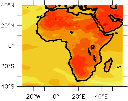
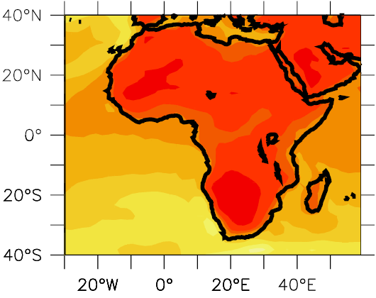
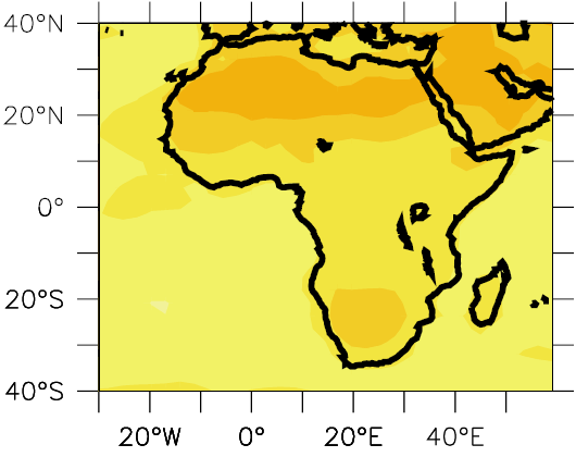
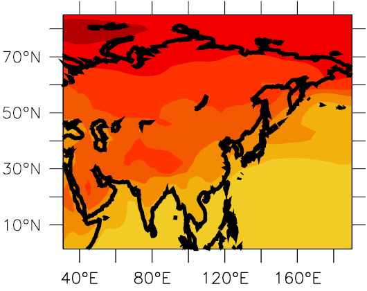
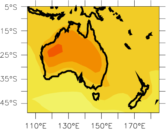
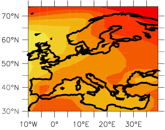
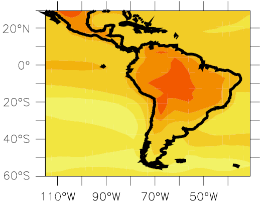
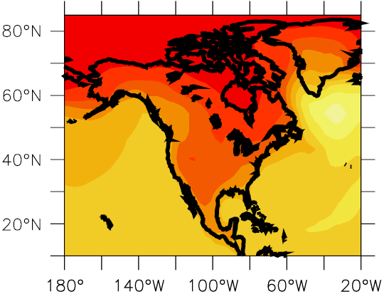
Use the interactive below to read information about and view maps of regional projections of future climate. Maps include changes in temperatures and in precipitation.
Use the two popup menus along the top edge of the interactive to select a map to view. You may choose from eight different regions, and can display either changes in temperature or changes in precipitation. These projections represent averages from 21 different climate models. They show how much change is expected near the end of the 21st century as compared to late 20th century values. Specifically, the maps show the projected average values for the years 2080 to 2099 as compared to the average values a century earlier (1980 to 1999).
Credits: Images courtesy of the IPCC (AR4 WGI Chapter 11 Supplementary Materials figures S11.5 through S11.20). |
Click here if you would like to compare some of these regional temperature and precipitation maps side-by-side.
Below is the same information displayed in the interactives above, minus the precipitation maps, layed out in a table... in case you find it more convenient for printing, etc.
Click here to view an interactive map showing Future Global Warming Impacts by Region (roll your cursor over regions to read about the impacts in each locale).
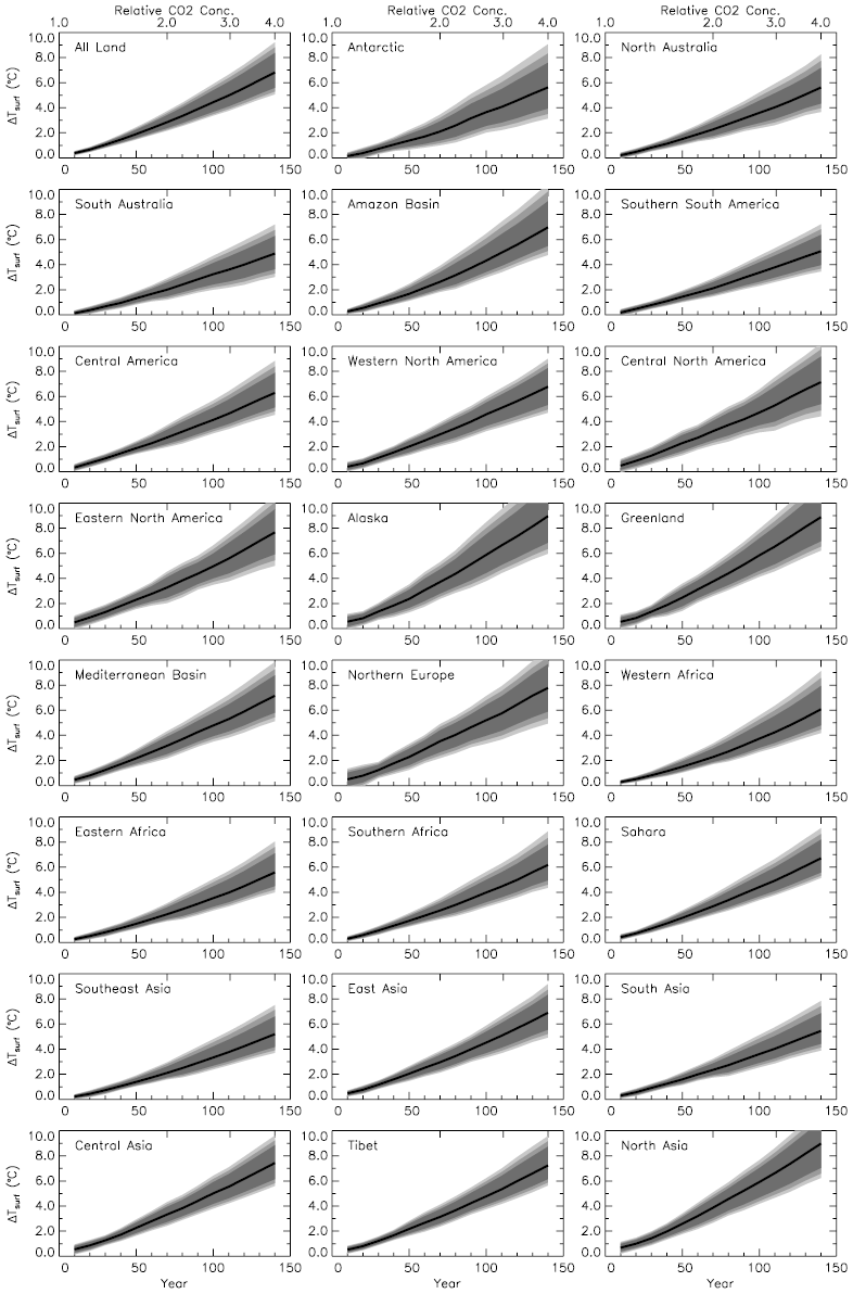
Projected temperature changes during the next 150 years for eight regions and for all land surface (top, middle). Click on the image to see a larger version that includes fifteen additional regions. The emission scenario used in these model runs assumed a 1% annual increase in CO2 concentration throughout the 150 year period. In each graph, the black line represents the most likely trend; the shaded regions around the line indicate 80%, 90%, and 95% confidence ranges. Notice how:
Credits: Images courtesy of the IPCC (AR4 WG 1 Chapter 11 Figure S11.36). |